
8. Extensions (Copy)

The three skills we've just learned are the ‘essentials’ with good reason. They’ll add instant impact to your photos - making them stronger, clearer and more dynamic.
If you’re up for a few extra strategies - there are 8 of them below.
Please note: The list below doesn’t follow any order of importance - truth be told, they’re actually ordered according to length (i.e. to best fit the roof frame)!

Put it in the center
I love ‘rule of thirds’ but there are times when putting your subject in the center also works (even though, as mentioned before - it’s easy to do, but hard to do well).
Putting your subject in the middle of the frame brings prominence to it. The viewer is directed immediately to the subject (which can be great for portraits).
This will usually work best when your subject can really hold its own, or when there is a symmetry in the background.
Remember to be careful using this strategy as sometimes the result is an image that feels static or boring. And - as a lot of snap shots are like this, you can often achieve a stronger impact by putting your subject off centre.
However, now with the warning aside - this is still a strategy I love. I might be biased though, as I’m a bit in love with Wes Anderson’s style, and sometimes watch his movies on mute just to absorb the colours and composition. Fortunately, we all have our own preferences:


To use this to best effect - get yourself squared up exactly to the subject
i.e. straight in front of your subject and not to the side.


2. Frame within a frame
The first frame is the four edges of your image.
Finding a second frame within the scene, often adds context and depth to an image and could be anything; a tree, doorway, window…
This second frame also guides the viewers’ eye directly to what and where the subject is, and can also help us eliminate distracting and unnecessary elements. It can also add a sense of mystery for the viewer, who wonders what is beyond the visible frames.


3. Negative space
Finding a clean background directs focus onto our subject. Creating a huge area of ‘clean background’ is what we call negative space. It’s the area around the subject that remains empty. If the negative space is the unoccupied area, then the positive space is the occupied area, aka our subject - and putting the negative and positive side-by-side forces our attention to the subject.
The rule of thirds often works really successfully with negative space but it doesn’t always have to work together. Sometimes putting the subject in the middle might be best. Or really far to the side for an even more dramatic effect. It’s very much down to personal preference and trial-and-error.

Because this boy is looking to the right, ideally I’d have used negative space on that same side - but in reality, there were windows starting just at the right edge of the frame - which is why I put the negative space where it is.


4. Don’t mergE the head.
What’s a merged head?? Here’s an example below that still pains me today. It’s a photo I took in India over 15 years ago. No matter how many different ways I crop it, I’ll never be able to fix it because the subject’s head is merged with the background. I had felt so proud of this image too (the colours, light, how I walked for such a long time to get to that exact position…). All pride vanished shortly afterwards when I looked at the image on a computer screen and noticed I’d impaled this man’s head with the wooden pole behind him.

So, to elevate your images, make sure you give space to each subject in the frame. Try not to merge the subject’s head with distinctive objects in the background, that can direct attention away from the subject.
You can experiment with how easy this is by imagining, when you’re next sat across from someone, that you’re taking a photo of them - and, by only moving your body slightly one way or the other way, see if you can un-merge objects behind their heads. You might have to warn them you’re doing this first! Once you start to see the problem, you might not be able to stop.
Without a doubt, if the subject’s head is in a clean space - the image will be better.
I noticed the image below on the cover of a newspaper on 2 June 2020. It’s a perfect example of the power of giving the subject a clean space that stopped me in my tracks. Imagine if the chin of the man at the front of the image had merged with the people in the background. It just wouldn't have the had the same impact.

Photo by: Josh Galemore/Arizona Daily Star via AP
Examples
Here’s some examples of mine about how not to do it. A slight change of the camera angle was all that was needed to have improved these 3 images below (as shown in the 4th image).


(Also avoid cutting off limbs).
If we’re talking about giving all heads their own space, we should also talk about keeping limbs in tact.
Cutting off a hand or foot can make an image feel incomplete, unintentional and even a little strange. This happens especially when it’s just a toe or finger that’s lost from the frame - rather than a portrait for example, that is intentionally from the waist, or shoulders up.

I love everything about what this photo portrays - except that I chopped off the tips of the toes!

The moment is great - and we don't need the legs, but the image would have been even better taken from half a step back, to include both hands.

Without the full ear, the image wouldn’t have felt complete. Even as it is, it feels uncomfortably close to the edge.

Even if this image was in focus, I still wouldn’t have delivered it because of chopping off the hand.
5. Leading lines
Leading lines are usually diagonal lines that draw the viewer’s eye to the subject. These diagonal lines can be straight or curved. Curved lines have a more gentle feel, bringing the eye in more slowly than a direct line, which takes us immediately to the subject.
Leading lines can be anything; roads, bridges, doorways, window panes, carpet, hallways, hand rails - anything that brings your eye to the subject.
Note: When possible, be careful to keep any horizontal lines…horizontal. And vertical lines…vertical. Our eyes are quick to spot if they are slightly skewed.

Arrows indicate the leading lines below which add a dynamism to images.

““When people ask me what equipment I use – I tell them my eyes.””


6. Layers
Adding a layer to an image means aligning different elements within one frame. For example, we can intentionally position one subject or object in the foreground, and another subject or object in the middle of the photo and/or background.
The two most common reasons to use layering as illustrated below are:
To help clean up the scene by using a layer to eliminate clutter or distractions, or
To add more understanding/meaning/depth to the overall image by adding extra information.

Decluttering
The foreground object on the right has eliminated the distractions on top of the piano, directing focus solely to the mum and her son (and extra chair)!

Adding meaning
Including mum in the foreground might make us wonder if the boy is learning to do his shoes up, as she waits patiently…
How to use Layers?
To add a layer effectively we usually have to be close up to the first layer, and then make slight changes to the camera angle to position the other elements where we want them.
These two examples below are the only ones I could find, where I’ve intentionally added something to 3 layers - and with limited success. It’s hard to do! I find Alex Webb’s work quite incredible in how he effectively use layers. This photo is one of the best there is.


Mostly, I use two layers to make an image more interesting - usually placing something important in the foreground and also in the mid- or background. This gives the photo some extra detail and a more complex feel to it.
Just be careful to add a layer intentionally - so there is a reason for it being there, and it’s not distracting. The same principles apply from Lesson 2: Everything in the frame should have a purpose.

Layers showing daily Life at Halloween time.

Layers show the entire family at a visit to a Petting Zoo.

Using layers to show all family members as they walk to the bus station.

A simple use of layers to show siblings in Summer time. Notice how the vertical lines stay vertical - even while the photo is shot from an angle.

Layers let us include the foreground object which gives context as to why this boy needs comforting, i.e. that he’s just fallen off this toy.

The foreground layer gives us a greater depth of understanding to this moment and family life with a newborn.

Layers that reveal a moment in family life.
7. Show Details
Another strategy to use is only showing details - meaning there’s a part of the scene we’ve intentionally left out. This is also a strategy that works great when just showing hands or feet (especially with newborns)!!


Images that focus on details are still as rich in memories and moments as images showing a wider picture. So don’t be afraid to really get in close to show only a certain part of the scene. Such images can be fun, dynamic - and also add a sense of mystery to a photo too.


8. Patterns
Our eyes love to find patterns (and structure) - but even more than this - we love to find something that breaks a pattern.
For example, here we notice 3 vertical columns, and at the same time, are drawn to the person who breaks the exact pattern.


Pattern: 3 faces
Breaking the pattern: Face that’s not smiling

Pattern: Legs
Breaking the pattern: Girls face.

Pattern: Blue legs and blue socks in one direction
Breaking the pattern: Purple leg in the other direction
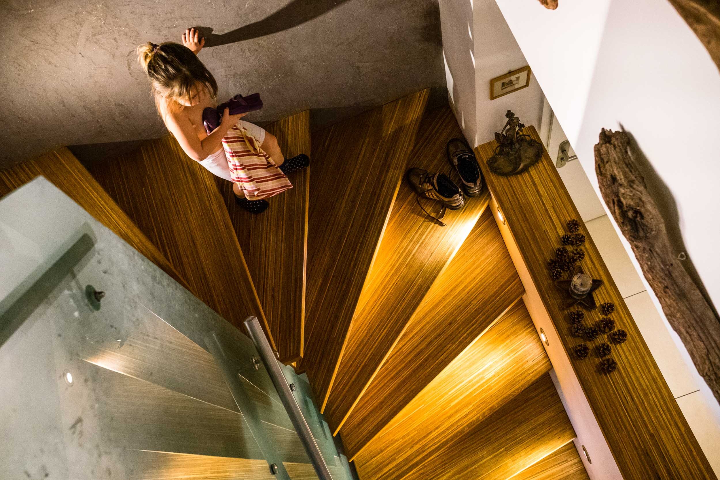
Pattern: Stairs
Breaking the pattern: The girl walking down the stairs
In connection to patterns:
In visual images we are also drawn to odd numbers - because it’s often easier to create a more interesting shape.
So if you can find groups of 3, 5, 7… etc it often makes for a stronger image.


The pictures are there, and you just take them.
ROBERT CAPA

Our Final lesson is next!
Estimated time required: 15mins